Logo,
Branding,
Website
Redesign the company logo to look more reflect the growth of the business yet keeping the same branding and style.
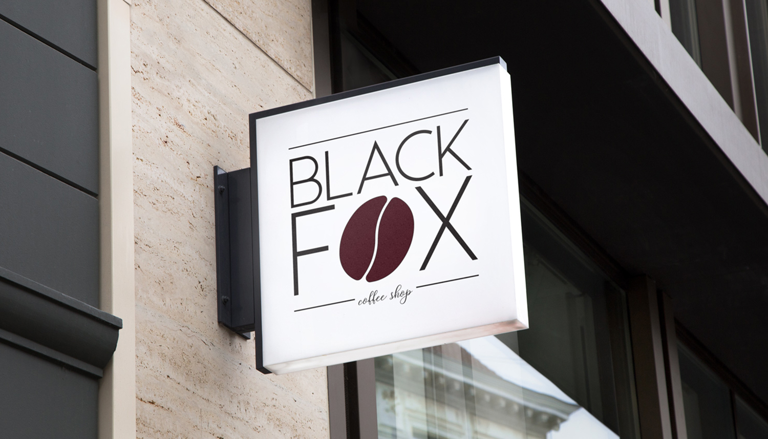
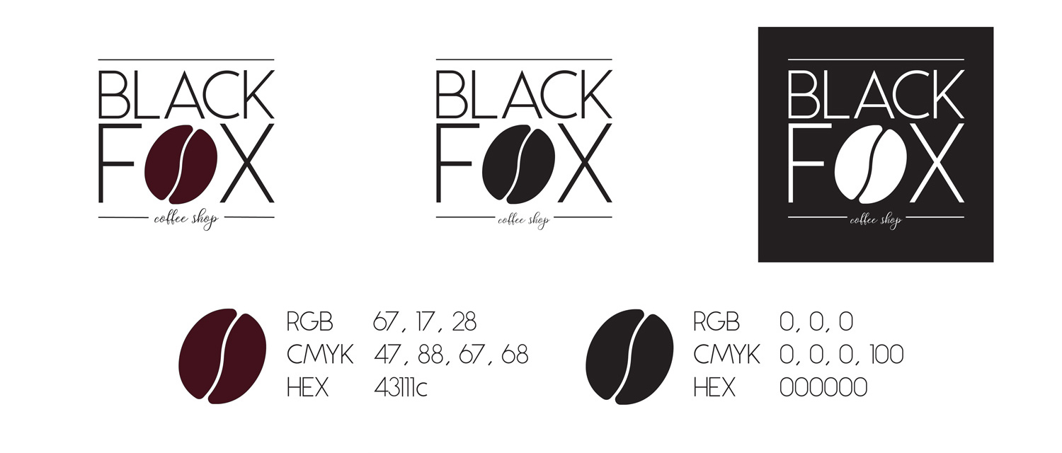
A more recognizable logo that fits with the more modern and hipster clientele. Gave an update to the colours to make the brand more bold.
Black Fox Coffee Shop is my own take on a coffee shop brand. I wanted to create a brand that had a catchy name, simple look, and that would fit in with a young hipster clientele. I wanted to create a brand that would be a go-to downtown location for people to go to rather then a brand name location. The first thing I came up with was a name. I brainstormed coffee shop names that would incorporate some sort of coffee lingo. Most names sounded too generic with the name coffee or bean in the name. After analyzing different types of coffee, I used dark coffee and my favourite animal to come up with the name Black Fox.
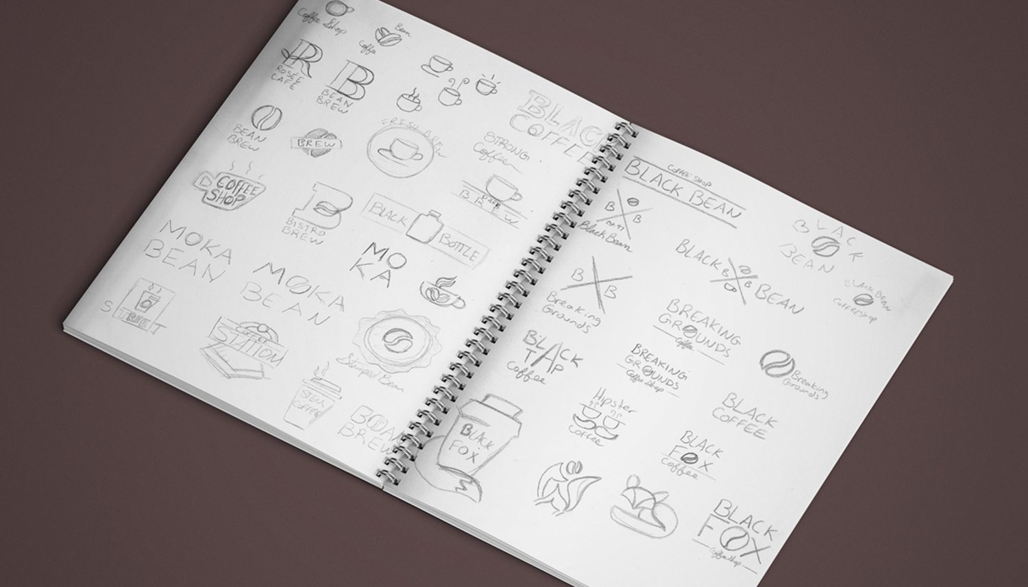
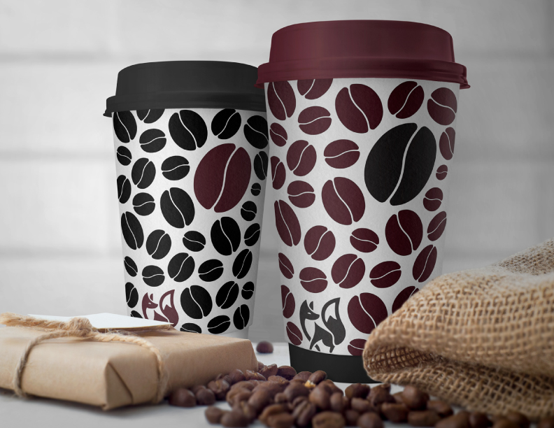
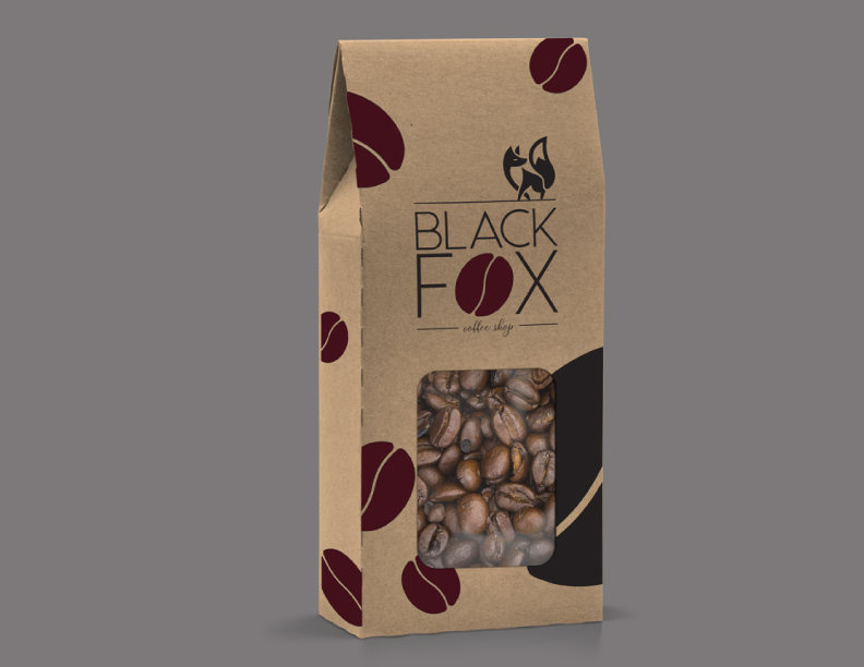
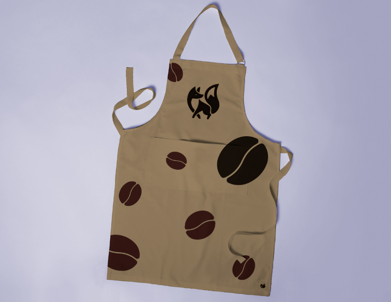
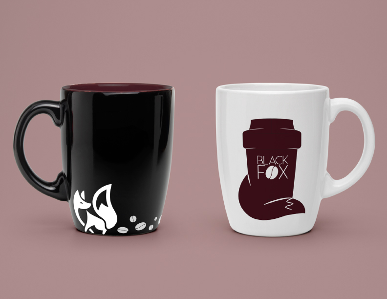
With a name in mind I began the sketching phase to come up with a wordmark and a signature look for the brand. To keep the coffee shop look, I did research on what coffee shop logos look like and what they are missing. After playing around with the type for the wordmark I was able to substitute the O with a coffee bean. With this look I was able to incorporate iconography into my word mark and have it still be legible. Since the coffee bean gave the logo a signature look I incorporated it into the rest of the brand by using it to cover tins and coffee cups. To go along with the black I used a maroon to give it a more sophisticated and elegant look, to go along more with the target audience. I also wanted to steer away from the greens, browns and reds that other popular coffee shops use to make this brand more unique.
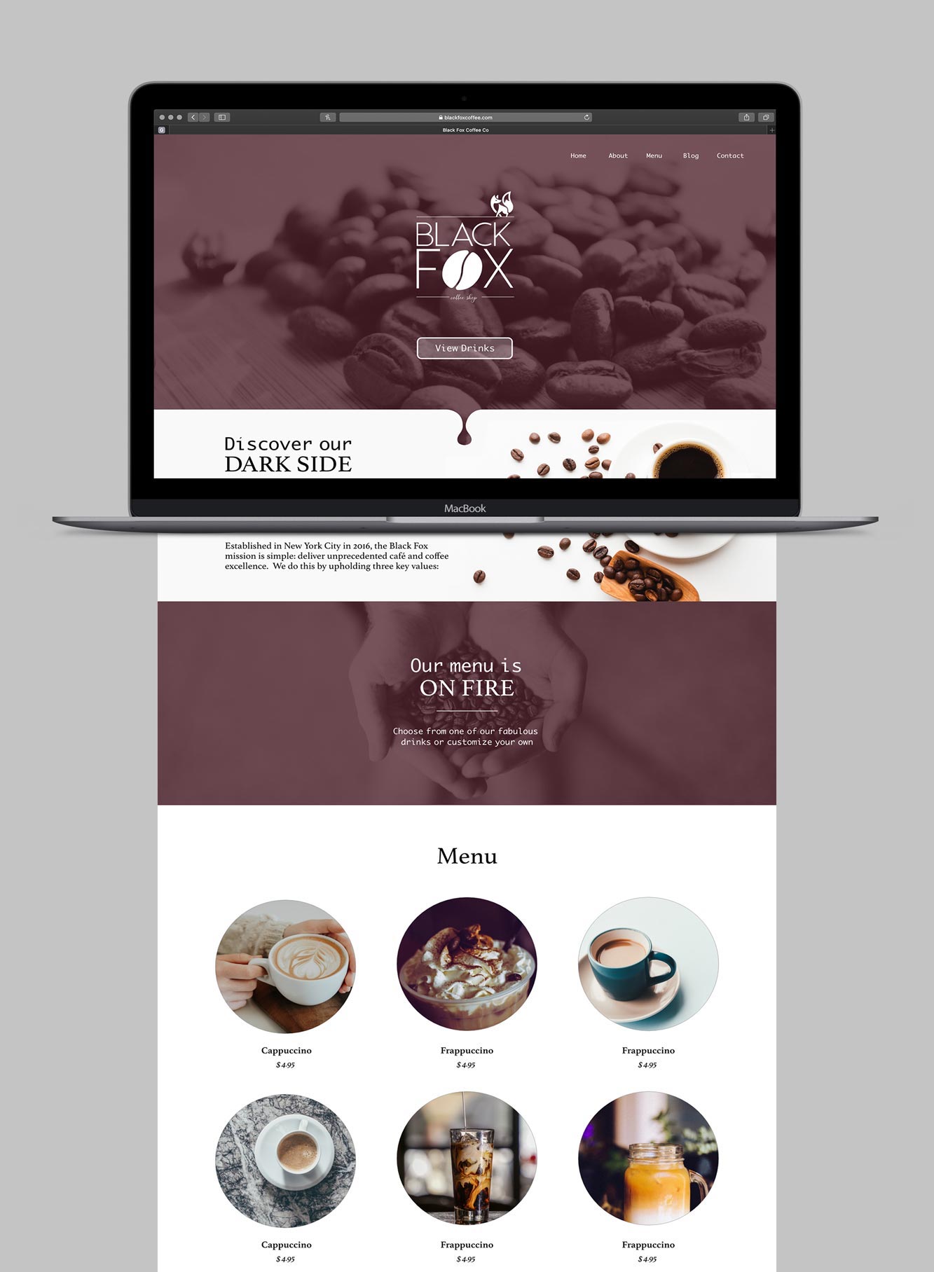
With a logo update the website had to get a make over to match. The previous website used lots of black and brown which made the website look drab and dull. Although it matched the shop name and brand it didn't allow the coffee to stand out on the page. With the new maroon brand colour added to the colour pallete that was used on the current site as the main website colour. It acts as an overlay for the coffee images while the menu pictures don't use any filters so that you clearly see the look of the drinks. The maroon acts as a great complement to the brown coffee and adds some more visual interest to an other wise minimalist look. Keeping the same white space as the previous website.