Branding, Logo
Redesign the company logo to look more reflect the growth of the business and the brand while keeping it a bold and strong. Create a logo that fits better with customer logos and partners visually. The logo must work in a square or rectangular space depending on where it will be shown.
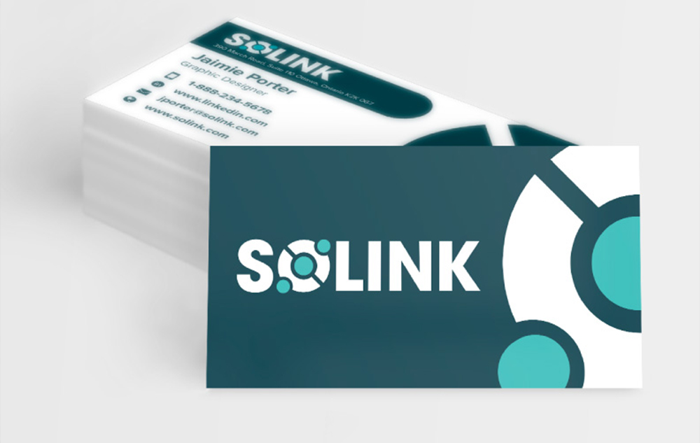
A stronger and more recognizable brand – logo, messaging, collateral such as business cards and tradeshow handouts, and a social media presence. Gave the product a new set of colours to build a stronger look and feel that ensured to its users that it is a reliable and trusted platform.
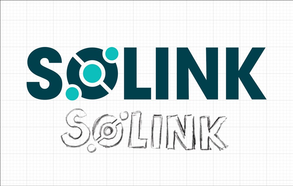
Solink is a video security company that helps their clients find theft and improve operations in their businesses by giving them total visibility. As a tech company the original logo used a typical blue colour that can be associated with many tech logos (ie microsoft, facebook, twitter, word, etc.) Moving forward I wanted to stay within the blue family for the final product but changed it from the typical technology blue to stand out from other tech company logos. Since the original logo was long but short it made it awkward to put it on documents with other partner and client logos. The additional S icon that was added to the left side of the logo added unnecessary length while the font choice made SOLINK look very compressed.
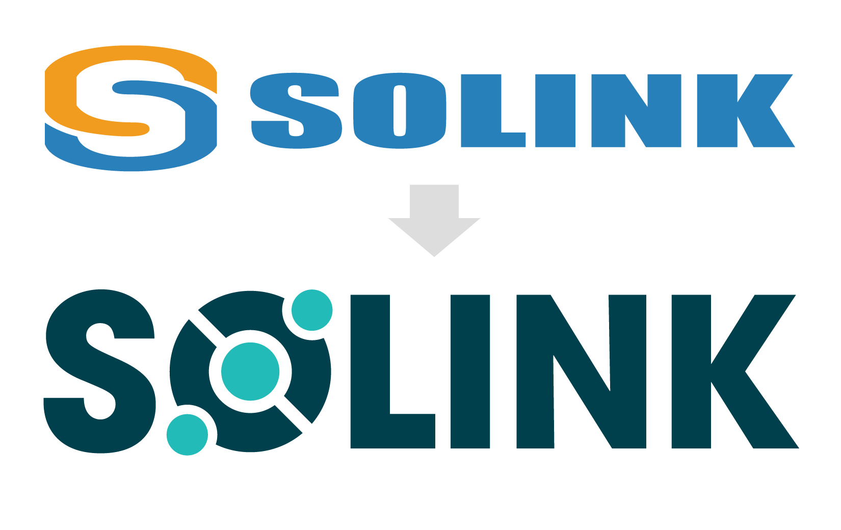
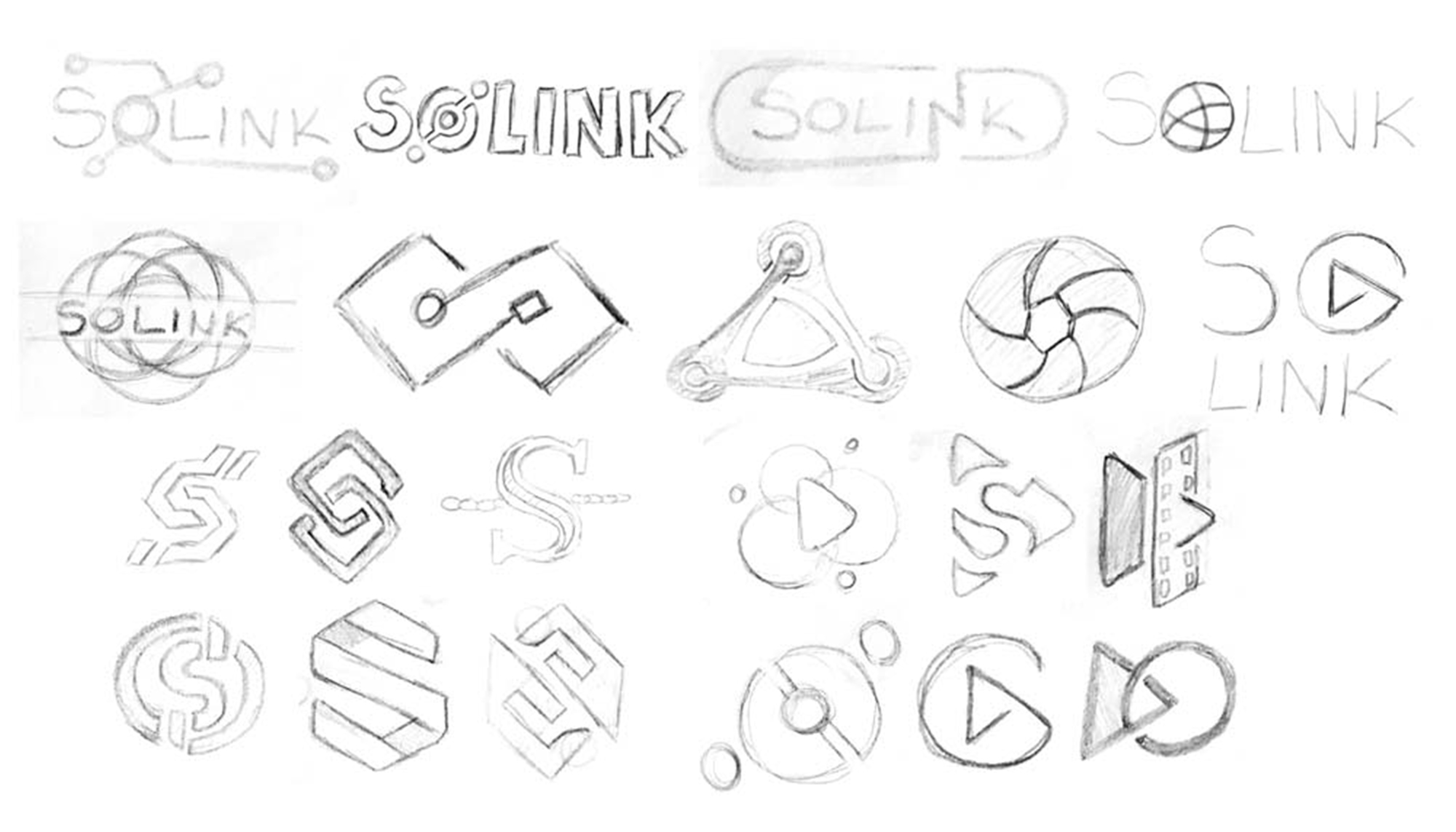
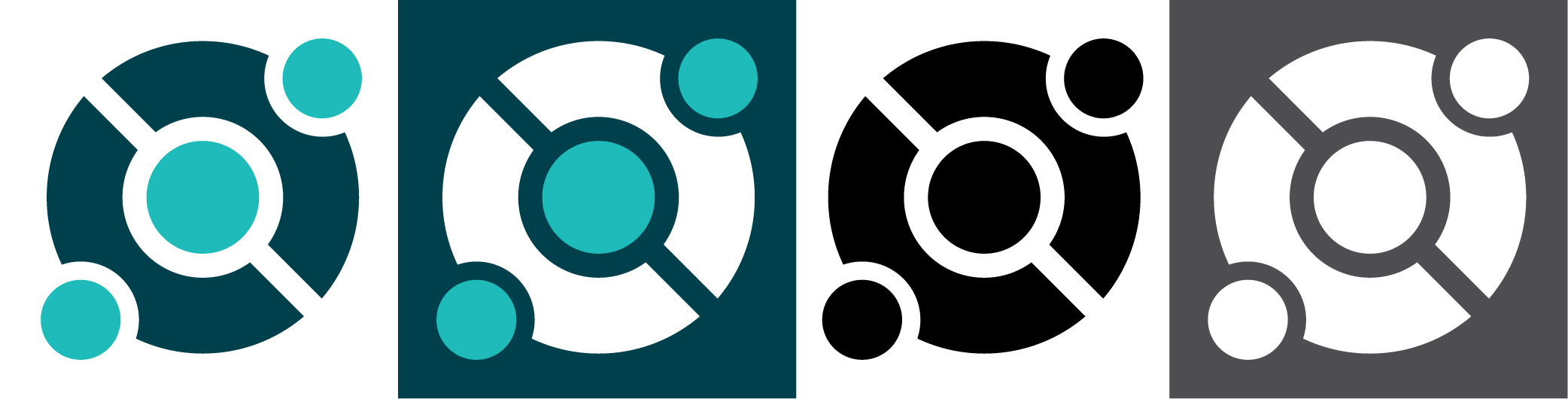
When sketching out ideas for the logo I wanted to adding an icon into the word SOLINK so that it wouldn't add unnecessary length to the logo. Along with that it could stand alone as an alternative logo. The original logo had two links forming the S to represent LINK in the company name. Without being so literal I came up with the idea to use the O in the name to link three dots together.
The three dots are very representative of the company since they talk in threes a lot.