Web design, Marketing
Redesign landing pages to grab the viewers' attention and increase landing page view time. Increase webpage visits with interlinking and stronger SEO.
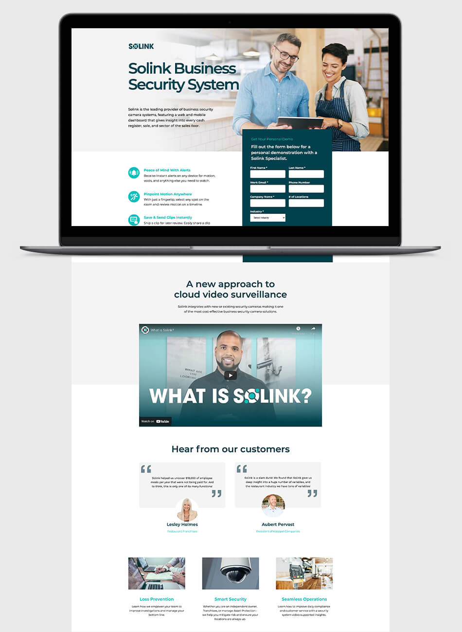
Simple to read landing pages that get to the point above the fold. Landing pages that give context to the viewer with introductory paragraphs to educate and provide CTAs and forms to help drive sales without the need to scroll much.
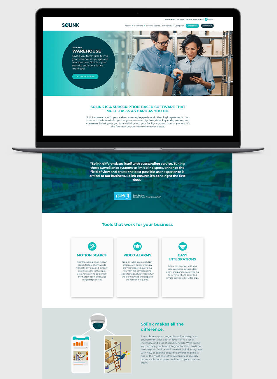
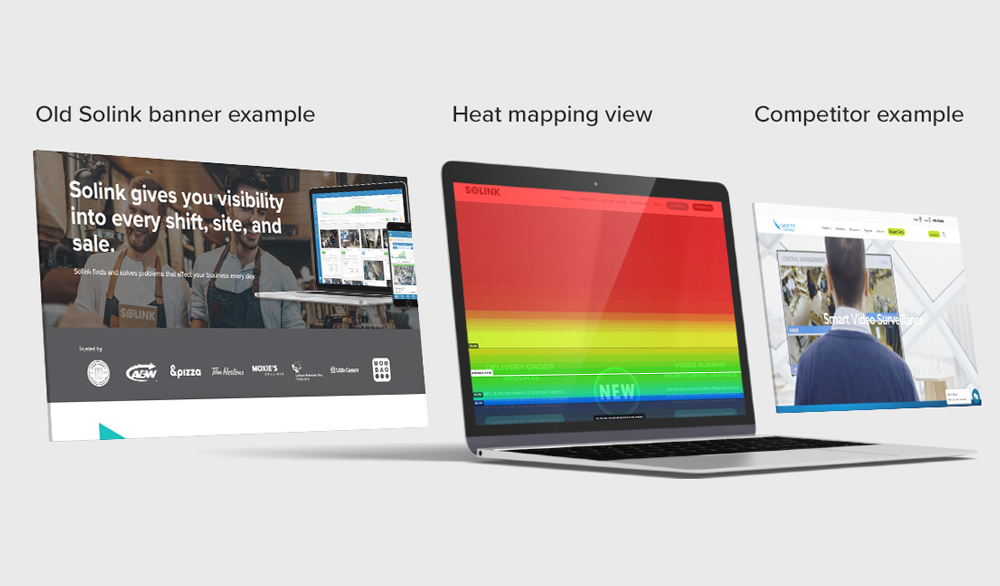
Homepage banners are essential to capture your audience's attention so that way they read more and want to learn more about what you are showing. I researched how to try improving it overall and how to improve it from our competitors' banners. The animated banner took too long to load, was too tall, and the banner text was constrained to a circle that took up less than half the banner. Many other tech companies have tall banners and don't have CTAs front and center to reel in customers.
To improve our banner, I reduced the height of the banner that way viewers can get a glimpse of what's below the banner and entice them to keep scrolling and learn more. Removing the circle around the text allows the text to be larger and take up more space in the banner. Thus, making it bolder and more readable. Reducing the text to something shorter and more to the point tells the viewer what we offer before reading more.
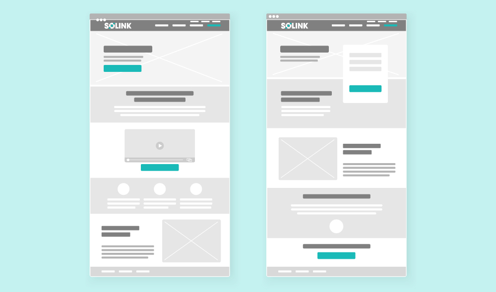
The main priority of each landing page is to talk about the benefits of Solink right away to entice people to read more or to book a demo. Knowing how vital real estate is above the fold means that there has to always be a CTA or a form for people to fill out because we can't count on people scolling further down to get to a form.